How to make PDPs work better for you
Aug 10, 2022
Welcome to Hulla’s School of Thought - our latest series of content dedicated to exploring fundamental aspects of ecommerce, through the lens of Hullabalook.
Customers have often told us that they like the way we think. For us, there’s no better compliment. We are technologists, but we’re also ecommerce lovers. We believe that technology should be used to enhance our everyday lives, and we hope that our technology can be used to make shopping experiences better.
We put our energy into building technologies that help solve the bigger problems in retail - such as making product display pages (PDPs) work better for our customers.
So, yes you guessed it – this month we’re talking all about PDPs! The bad news is that visitors who enter your site by landing on a product display page are 72% more likely to bounce than those who land on a different page type. The good news is that we’re here to help.
Overcoming Choice Paralysis on PDPs
Everyday, shoppers face choice paralysis when they land on PDPs. It’s a retailer's job to think one step ahead and ensure shoppers have all of the information they need, can find the product they’re looking for and feel confident enough to purchase it.
We aim to help retailers achieve this in as few clicks as possible. We want to take the work away from the shopper and provide them with a fluid, inspirational experience.
Usually, when a shopper lands on your PDP they fall into one of following scenarios:
- They like the product, they want to buy it.
- They don’t like it and need an alternative.
- They like it and want to purchase some accessories alongside it.
Let’s delve into these a little more… school is in session!
Scenario 1: They’ve landed on your PDP, like the product but need a little convincing to click ‘buy’
A lot of retailers suffer from high bounce rates on their product display pages. While this could be due to products being out of stock or having high price points, most of the time it's because the page doesn't display the necessary information needed to make the purchase.
A shopper lands on a PDP and likes what they see. You cannot assume that this customer has any prior knowledge of your brand - they could just as likely be at the top of the funnel as be at the bottom. What you can do is offer an inspirational PDP shopping experience.
It’s essential that you provide as much information as you can about the product, to limit any insecurities - this includes key information such as size, compatibility, type, fabric etc. We see a lot of retailers optimising their PDPs with influential content such as customer reviews, influencer marketing or product photography displaying the product ‘in use’. This is really powerful, because shoppers can relate to the content and imagine how they would use it at home. MADE.com – who use Hullabalook technology live on their site – does a great job of this.
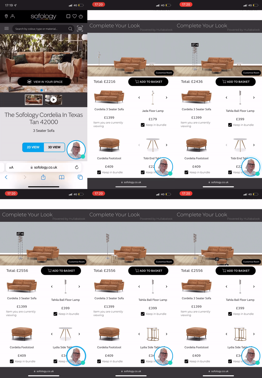
All of our customers tell us that beautiful photography plays a huge part in their ability to sell products. However, if you’re a retailer with a large product catalogue such as Sofology (who have hundreds of different variants of sofa styles/colours), taking photographs of every sofa variant is too costly. Our Visual Bundles technology solves this problem (and many more!) by automatically generating a lifestyle image featuring the seed product on any sofa PDP.
Scenario 2: It’s not the right product, they want to see alternatives and you want to keep them on your site
If a shopper lands on your PDP and can’t see the product they want – due to stock issues, price, or because it doesn’t meet their criteria – what happens next? Most of the time the shoppers' purchase journey ends there.
Most PDPs don’t inspire shoppers to actually shop. They show information about one specific product and then, more often than not, show you a bunch of products that don’t match your search.
We believe that this is a big issue in ecommerce, which we’re dedicated to solving. We try to challenge the status quo by asking the difficult questions and reimagining ecommerce site pages.
For example, why can’t a PDP become another PLP? This is where the Hullabalook philosophy comes into play. Rather than forcing a purchase journey to end, wouldn’t it be great if you could show this potential customer all of the next best products, based on the attributes of the seed product they’re viewing.
Let’s put this into context
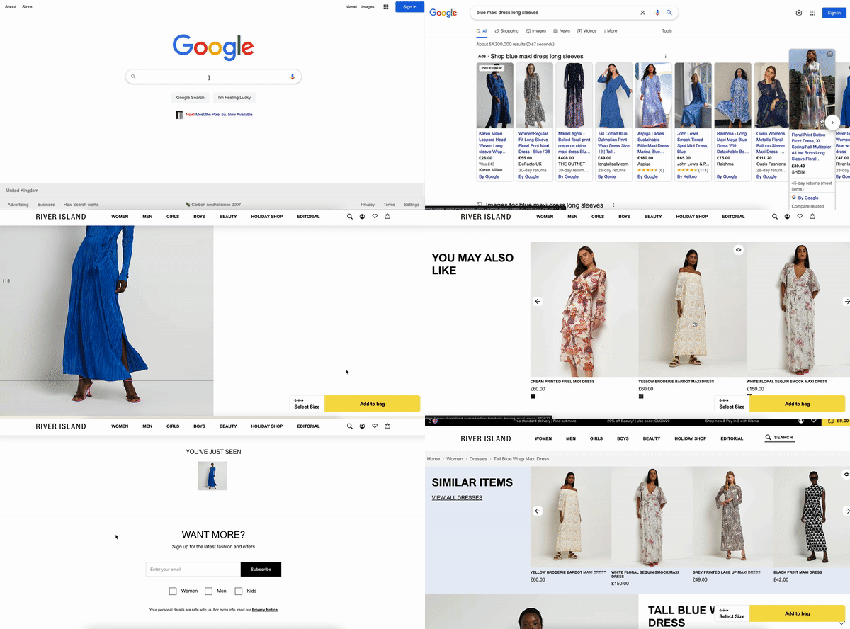
I’m attending a party and want a blue, maxi dress with long sleeves to wear. Like most shoppers, I head to Google Shopping and click on the first dress that catches my eye.
I landed on this PDP and I like some aspects of the dress, but it’s not quite right. I’d like to see similar dresses but the carousel of alternative dresses I’m shown doesn't match my criteria. None of the dresses are blue, some are maxi and some have long sleeves but they look nothing like the original dress I clicked on.
In this scenario, I can't find what I’m looking for so I’ll probably exit the site and restart my purchase journey elsewhere.
A Hullabalook online shopping experience would look like this:
- I land on blue, maxi dresses on Google Shopping.
- Click the image I like, leading to a retailer's PDP.
- I decide the product isn’t right, but I’m shown some alternative products which match my original criteria.
- Now, I have the option to like or dislike certain attributes about each product. For example, I like that it’s blue, I dislike the material. I dislike the neckline, but I like the overall style.
- The product grid is automatically re-ranked to feature the most relevant first and I haven’t had to click a million filters to get to the right product.
Most ecommerce sites don’t give us the option to negatively filter like this, but it would make my online shopping experience so much easier!
This concept works well across multiple industries. Here’s a live example of it working for Trail Appliances, our Canadian electronics customer. They are currently using it across their PLPs, but the same approach can be applied to PDPs.
As I interact with my filters, the listings page is automatically re-ranking to feature the products which most match my criteria. I said I liked LG products, so the PLP re-ranked to show me LG products first. I said I didn’t like the colour white, so the PLP re-ranked to show me products that aren’t white first. Giving me this option to negatively filter my results has made it much easier to find what I want and increased the likelihood of my purchase.
Scenario 3: It’s the right product, they’re open to buying additional accessories and you want to increase attach
Every retailer wants to increase attach rate at the point of purchase, but most bundling solutions on the market aren’t performant, either because:
- They’re manually configured, take up a lot of valuable time and are prone to human error
- They’re not inspirational because they don’t offer visual aid and aren’t customisable
- They’re recommending products based on previous sales data, which doesn’t take into account new products and is biassed towards the best selling products (which may not always be relevant within every product context)
Hullabalook’s approach to visual bundling is different.
First, it’s important to acknowledge that bundling solutions differ between markets.
- For electronics, a bundle almost always signifies a discount.
- For homewares, a bundle (or recommendation) will focus on inspirational product combinations without any associated discounts.
- For fashion, it’s often a set of additional accessories that work well together with an outfit.
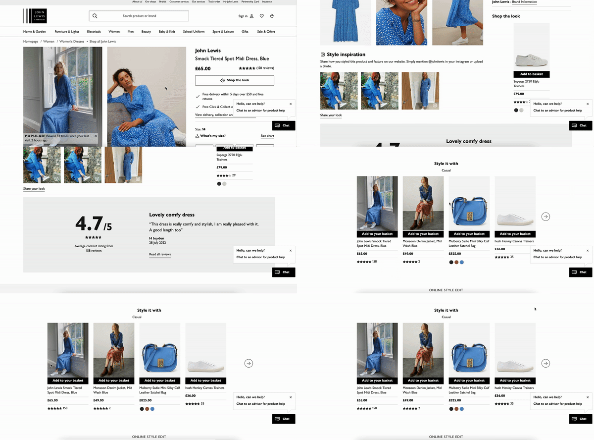
Let’s look at a current example using the same criteria as earlier. As you can see, John Lewis uses some great UGC (as discussed earlier). Their ‘style it with’ section is recommending products which seem to have similar attributes. However, it’s not very interactive because the bundle is static, there’s a good chance it has been configured manually, and I need to click into each individual product in order to really visualise it. Retailers are always looking for ways to make their pages more inspirational and interactive, yet their bundles often lack customisability and don’t provide the shopper with any visual aid.
We believe there is a much smarter approach to this. An approach which requires no manual updates, recommends products based on specific attributes, is customisable and helps shoppers visualise products easily. Surprise, surprise, its Hullabalook’s Visual Bundles solution.
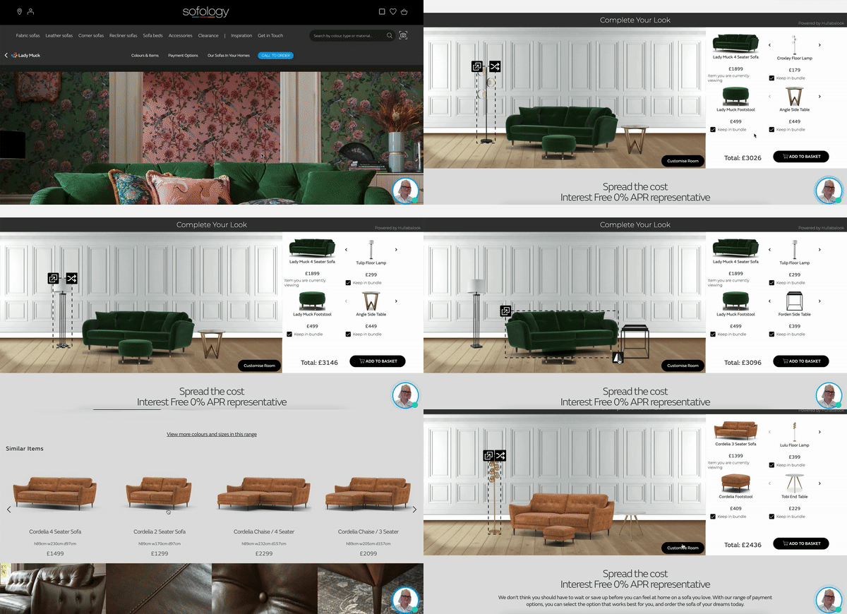
Unlike the current solutions available on the market, Hullabalook’s Visual Bundles are completely automated. Our technology automatically produces a bundle of complementary products based on the attributes of the seed product your customer is interested in. So if they’re looking at a sofa, we’ll show them the matching footstool alongside additional accessories matching the aesthetic.
As you can see, all of our bundles are rendered onto a photorealistic lifestyle setting, because we understand that visualisation plays a major role in the purchase journey. Shoppers also have the freedom to customise their bundle by choosing the type of accessories they prefer. Sofology saw huge uplifts in footstool and accessories attach rate when they launched Visual Bundles on their PDPs.
Revamp your PDPs
As you can see, we have a lot to say when it comes to PDPs. We’re really only just scratching the surface here. We talked about solving real problems retailers face - so if there’s a certain problem you’re facing as a retailer, or something you wish worked better while shopping online as a general consumer, then we’d love to hear from you.


